I wanted to become a teacher because I enjoy working with children and I found I enjoyed learning about education. I've spent a lot of time figuring out what I like about education and learning how to be a teacher. The only thing I can say is that I like learning about how to teach young people and how much I've grown by learning about myself in the process. I've learned how to teach about reading and what the steps are. I really struggled with reading and the way that they were teaching me just didn't cut it. By learning these different strategies and phonics, I've learned the basics of reading all over again and it's fascinating. At this point I don't know if I want to become a classroom teacher. I really struggle with explaining things in a way that's simple and concrete to children. I really need to work on it but I also don't know if I have it in me to be over almost thirty odd students every day. However, I do want to work in education in some small sort. I was thinking maybe I could be a reading aide since I really struggled with reading, it could benefit a young child because I could relate to them in that matter. I don't know what I want to do but I really enjoy my classes and want to keep doing it, I'm just struggling with wanting to be a classroom teacher at this point. We'll see what happens in a year from now when I graduate....
Here are a few links that can show how blogging can influence the classroom:
Collaboration Cuties:
http://collaborationcuties.blogspot.com/2012/10/fun-with-weather-and-clouds.html
Diary of a Not so Wimpy Teacher:
http://www.notsowimpyteacher.com/search/label/Multiplication
Thursday, October 22, 2015
Sunday, April 26, 2015
Monday, April 20, 2015
Art Practicum Presentation
This is a link to my art practicum that I presented in class. The lesson plan that I used was Geometric Painting. If you right click and open the link or copy and paste in the website browser you will be able to open it.
https://drive.google.com/file/d/0B1mA1P0-wd-5Wk55LWxwMEhUYWM/view?usp=sharing
https://drive.google.com/file/d/0B1mA1P0-wd-5Wk55LWxwMEhUYWM/view?usp=sharing
Three Lesson Plans for Art for Elementary Aged Kids
This first lesson plan is called Paper Plate Chinese Art. It can be done with ages 5th-6th or older. You do use watercolor paints and such but I think the kids would really like doing this. Here is a link to my lesson plan...
https://drive.google.com/file/d/0B1mA1P0-wd-5ZG9sOEtsSV9JcWc/view?usp=sharing
This second lesson plan is called Moving Lines. It would be a great project for ages 3rd to 4th grade. I think it could really work well for kids who are struggling with what diagonal, horizontal and vertical lines are. They must know them to really be able to do them so it's a great learning experience for them. He is my link to my lesson plan...
https://drive.google.com/file/d/0B1mA1P0-wd-5RkUxTFRRQ2ctQjQ/view?usp=sharing
This last lesson plan is called Geometric Painting. I did this with an art class and it was so fun for them! It's good for ages preK to 2nd grade. They really develop their fine motor skills with ripping tape and painting with a paint brush. Here is my link to my lesson plan...
https://drive.google.com/file/d/0B1mA1P0-wd-5TlZfcW1HbGFneGc/view?usp=sharing
Masquerade Mask
I researched what kind of masquerade mask I wanted to do first. I then went and got a pre-made mask and feathers. I started with painting a light creme color on the mask so the glue would stay when I started to place the glitter on the mask. I then used a really strong glue and I then poured glitter over my design. After I perfected that, I used sequins and then placed feathers on the right side of my mask. I really love how it turned out and I really enjoyed the process. I might even wear it for Halloween one year.

Milk Jug African Mask
I first researched what kind of design I wanted to do for my African mask. I then started with a milk jug. I drew my cutout lines first before I started to cut. I then used masking tape. It was really hard to keep the masking tape to not bunch up around the eyes. I then used brown shoe polish. I got out orange, red, blue, green, and brown arcylic paint. I then painted what I researched about african mask designs onto my mask. Lastly, I used a whole puncher to whole punch holes into the top of the mask to place the raffia in through the holes.
The one thing I know that would be hard for elementary aged students because it was hard for me, is to cut out the mask from the milk jug. It was hard to get smooth lines on the edges so thank goodness for the masking tape or there would have been some blood drawn.

The one thing I know that would be hard for elementary aged students because it was hard for me, is to cut out the mask from the milk jug. It was hard to get smooth lines on the edges so thank goodness for the masking tape or there would have been some blood drawn.
Zentangle Scratchboard
I first started with doodling what I wanted in my sketchbook. I then cut out a 6x6 inch square and then drew different shapes with pastels. I then mixed up my paint and dish soap together and painted it onto my square. It had to dry for over a day. I then used a fork and a dull pencil to sketch by lines into my scratch-board. I incorporated zentangle into my scratchboard by drawing in smooth flowing lines. It relaxed me by doing it this way and that's what zentangle is. I loved how the colors popped in my finished product and I love how it turned out. It was one of my favorite projects I did this semester. It was really messy though so I don't think I would do this project with anyone 3rd grade or younger.

Batik
I loved this project. It was fun to put glue onto fabric and paint over it and the design still stayed. I first started with drawing out my design on a 12 by 12 piece of paper that I used for my Mandala. I chose a leaf design and did a chevron design for the inside of the leaf which you really can't tell for most of my leafs but that is what it is. I then glued the design onto my fabric. The glue dried but it stuck onto my paper that I drew my design onto and so that was a bit difficult to get off. I then painted with non-washable acrylic paint. I let it dry over night and washed it off and this is my finished product. I really loved how it turned out!

Monday, April 6, 2015
Cardboard flower
I didn't plan on my cardboard construction to turn into a flower it just did. I loved how it turned out. Physically, it swishes and is fun to look at. I think eventually I'll glue it on a piece of cardboard and place it on my wall but how it is right now, I really liked how it turned out. I think it'll be fun to place it on my wall and say that by gluing random pieces of cardboard together can really make something that is cool to look at. I made it out of paper towel rolls. I cut it diagonally all the way around and then placed them strategically around a small circular piece of cardboard and it turned out really cool. I then thought well I don't want to see all the glued pieces around a small circle of cardboard so I cute out another circle and placed on top of the glued together pieces and it turned into a flower by accident. However, I like this accident. It was a fun project.


Light Painting
I had such a hard time with this project. I only had 5 seconds to do something and this is the best one I got out of doing for a little over three hours. I don't really have a preference with how it turned out or if it was what I wanted it to turn out like. I was just happy I got something and was able to turn it in. I think if I had better equipment then it would have turned out really fun. But because I didn't have the good equipment and I couldn't find a really good app on my android I wasn't able to do something that was really cool. This is what I got on my very last shot and I like that it's what it is.

Friday, April 3, 2015
Mandala
This is one of those art projects that I find is important to me. All of the symbols that I used for this project was meant to symbolize me and my life. The middle symbol is a shell that represents my love for the ocean. The added swirls are my favorite thing to doodle. The hearts represent my husband. The diamonds/squares represent my love for reading. I read a lot. The circles represent my wedding day. The corners were just a repeat of the symbols in the main part of my piece.
This project was really hard for me to finish. I didn't quite know where to start. I didn't know what I wanted from the mandala. However, when I finally got started I really loved how it was going and then when I was done I absolutely loved how it turned out. I think the one thing I would have changed would be to start sooner so I didn't have to hurry and end it to submit my assignment. Other than that I really love how my mandala turned out.

This project was really hard for me to finish. I didn't quite know where to start. I didn't know what I wanted from the mandala. However, when I finally got started I really loved how it was going and then when I was done I absolutely loved how it turned out. I think the one thing I would have changed would be to start sooner so I didn't have to hurry and end it to submit my assignment. Other than that I really love how my mandala turned out.
Thursday, April 2, 2015
100 Color Challenge
This 100 color challenge was well challenging. It was hard to find 100 different colors with only red, blue, yellow, black and white. I used acrylic paints for the first 60 and then water colors for the last 40. I think the colors were a lot richer with the acrylic than the water colors but it was a bit easier with the water colors. I didn't have to worry about the color mixing to be to watery with the water colors unlike the acrylic. I would change to water colors sooner next time but other than that I did what I set out to do with this project.

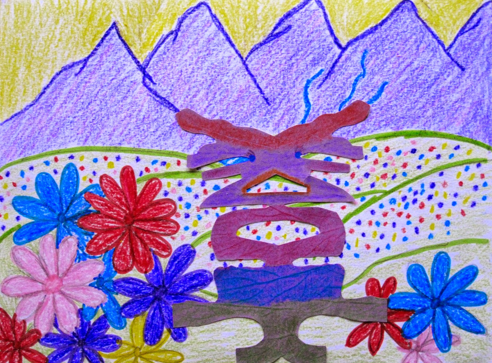
Alien Name
This was a simple and sweet art project for any age. My alien is beautiful because she has can blend in to her environment and then stand out when she wants to. She is apart of a beautiful flowery environment that has purple mountains and green fields. This art piece is important to me because is part of me. The alien is apart of my name and her environment is what I love in my scenery. I love blending in but I like to stand out when I want to. My alien is what I like. That is important to me.
Printmaking Project
I really enjoyed this project. It was fun to experiment with the designs on the plastic bags then place them on the paper. This was one of those projects I really enjoyed and made me appreciate art a lot more. This project was important to me because for a while there I had been really stressed about all of my assignments over the past two weeks before doing this. It was a stress reliever for me and made me enjoy art again. It made me realize that I need to relax and enjoy myself sometimes when it comes to homework.
My project went just like I planned it. That is after a lot of practice and failed attempts. However, that's how it's suppose to go with art. :) I would suggest this art project for any age and any time of day or time.
For my first printmaking project I painted the background light blue on water color paper. I used foam stars and a dull pencil to draw out designs on three stars. I then used three different colors on each of the stars to place them on the paper individually. The one thing I should have done would be to let the paint dry first then place the overlapping color on next.
For my second project I used plastic bags and cue-tips to draw designs on the bags then placed them on the water color paper one by one. Again I should have waited a bit longer to have it dry before I placed another plastic bag over the already wet paint. However, I loved how both my projects turned out.
Dolphin Foil Project
This one did not end up like I wanted it to. This one did not go as planned. My glue was too thin so I couldn't see the outline of my dolphin so I tried hot glue and that dried with hard pointy edges on it and then it ripped the foil. I was so annoyed by the end of it that I didn't want to re-due it. After that I tried to put the shoe polish on and the shoe polish didn't show up very well either so by the time I submitted this project I was not a happy camper and didn't want to go back and do a whole new one so this is my foil project. It's not a very pretty one but I do like how the whole picture turned out just not the ripped foil and lame shoe polish I used on it.

Purple Moutains (Geogria O'keeffe Inspired)
I find painting with watercolors is very relaxing. I really enjoyed making this painting. It was one of the more relaxing creations I've made lately. This painting was inspired by Georgia O'keeffe and her paintings. I was inspired by her landscape mountain paintings she had done. I originally didn't have the big sun in the center but then I went back and did that and added a few other things so I would say it did eventually turn out how I liked it. It just took a bit longer to finish it then my other creations.
 | |
| Original Painting before I added a few things |
 |
| Ending painting after I thought it through a bit. :) |
Water Color Emotions
For this project I used salt, wax, a plastic bag and rice to add effect to my wet water colors. The top left square I used salt to add some effect to it. This square is suppose to represent love and the salt is suppose to add the little sprinkles of love that you develop throughout life and the little holes or lets say white flecks left over from removing the salt represent the holes left from getting hurt by your loved ones. The middle top one is suppose to represent happiness. I didn't use a texture. I just mixed green and blue together to make the effect. It's happiness because I love those colors and just seeing them makes me happy. The top right one I used a drip method onto it to sprinkle excitement onto my square. I love the way it turned out and is my favorite out of all of them. Just looking at it makes me feel excited!
The bottom left one represents sadness. I used rice on this one and water droplets to represent tears. Sadness to me is the shedding of water, which I tried to emulate through my effects. The bottom middle is suppose to represent frustration. When I'm frustrated I start from a simple boiling to anger, which I'm trying to represent from starting from a light orange color and then going to a darkish black color. I did add some wax lines to it and put a plastic bag over the wet colors to get some depth to it. You can't really see the wax but that's suppose to represent the lines towards the anger I'm feeling just like the plastic bag impressions when I get frustrated. The right bottom represents anger. I feel spatters of emotions when angry and the multiple colors are suppose to represent that. I used a dripping/splattering method on this. I dripped water over it after I splattered the colors onto it.
I would say this was one of my more favorite art projects. I didn't have to plan it out a lot and I just had a fun time with it. It was simple but fun to figure out through color what I feel with certain emotions.
Notan
I was inspired by many Notans that I researched before drawing then cutting out my Notan. All the little pieces I cut out was very hard to keep straight. :) The gluing part was also hard. I had to re-due my first Notan because the cut out pieces were too big for the size of paper I used so I measured the square about a half inch smaller and it worked out great after that. I would say yes it turned out just the way I wanted it to. It was really fun to research the different designs others had done and then design my own based off my preferences. Here is my Notan.

Subscribe to:
Comments (Atom)